> ## Documentation Index
> Fetch the complete documentation index at: https://docs.uplifthub.io/llms.txt
> Use this file to discover all available pages before exploring further.
# Building creatives
> How to add creative components, upload assets, and preview your ad before it goes live.
export const Ui = ({children}) =>
{children}
;
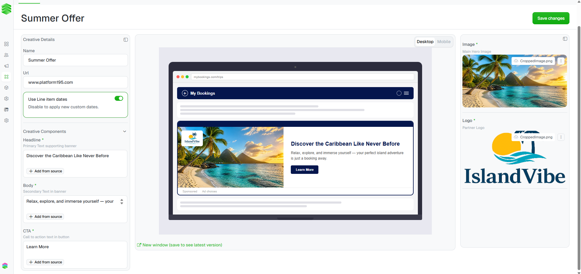
Once a creative has been created, the creative detail page is where you fill in
the ad content and upload assets. The page is split into three panels: **Creative
Details** on the left, a **live preview** in the centre, and **asset uploads** on
the right. Changes to components and assets reflect in the preview in real time —
click Save changes to persist them.
 ***
## Creative Details
The left panel shows the core details set when the creative was created: **Name**,
**URL**, and the **Use Line Item Dates** toggle. These can all be edited here
after creation.
***
## Creative Components
Below Creative Details, the **Creative Components** section contains the
text fields that populate the ad — typically **Headline**, **Body**, and **CTA**.
The exact fields depend on the template selected when the creative was created.
Type directly into each field. The preview updates as you type.
Each field also has an + Add from source option — this lets you pull
content from a connected asset feed if your workspace has one configured.
***
## Creative Details
The left panel shows the core details set when the creative was created: **Name**,
**URL**, and the **Use Line Item Dates** toggle. These can all be edited here
after creation.
***
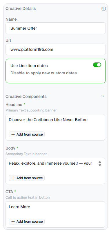
## Creative Components
Below Creative Details, the **Creative Components** section contains the
text fields that populate the ad — typically **Headline**, **Body**, and **CTA**.
The exact fields depend on the template selected when the creative was created.
Type directly into each field. The preview updates as you type.
Each field also has an + Add from source option — this lets you pull
content from a connected asset feed if your workspace has one configured.
 ***
## Uploading assets
The right panel handles image assets — typically a **Main Hero Image** and a
**Partner Logo**. For each asset you can:
* Drag and drop a file directly onto the upload area
* Click Select asset to browse your files
* Paste an image URL directly into the URL field
Once an asset is uploaded, click the **⋯** menu next to the filename to
**Edit** (crop/adjust), **Replace**, **Open in a new tab**, or **Remove** it.
Clicking **Edit** opens the **Adjust image** modal where you can crop and
reposition the image before uploading.
***
## Uploading assets
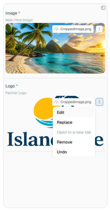
The right panel handles image assets — typically a **Main Hero Image** and a
**Partner Logo**. For each asset you can:
* Drag and drop a file directly onto the upload area
* Click Select asset to browse your files
* Paste an image URL directly into the URL field
Once an asset is uploaded, click the **⋯** menu next to the filename to
**Edit** (crop/adjust), **Replace**, **Open in a new tab**, or **Remove** it.
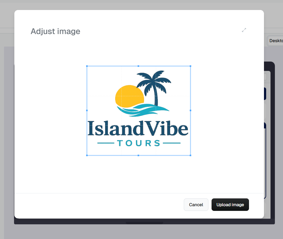
Clicking **Edit** opens the **Adjust image** modal where you can crop and
reposition the image before uploading.
 ***
## Previewing the creative
The centre panel shows a live preview of the ad as it will appear in situ.
Toggle between Desktop and Mobile to check both breakpoints.
***
## Previewing the creative
The centre panel shows a live preview of the ad as it will appear in situ.
Toggle between Desktop and Mobile to check both breakpoints.
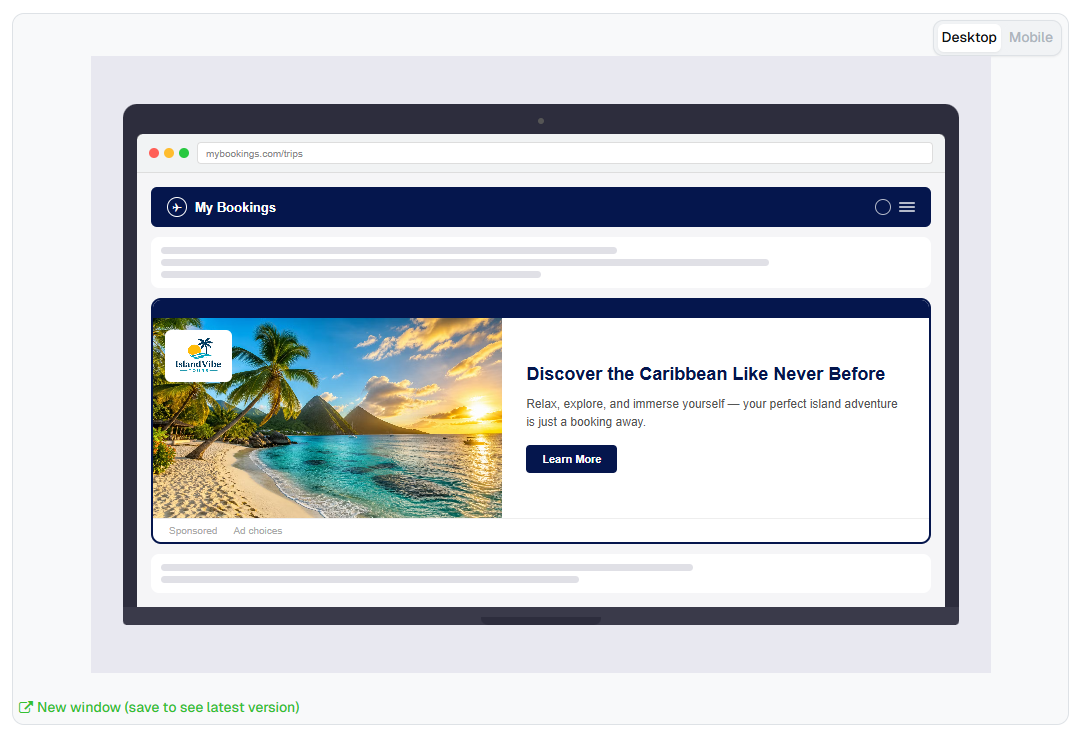
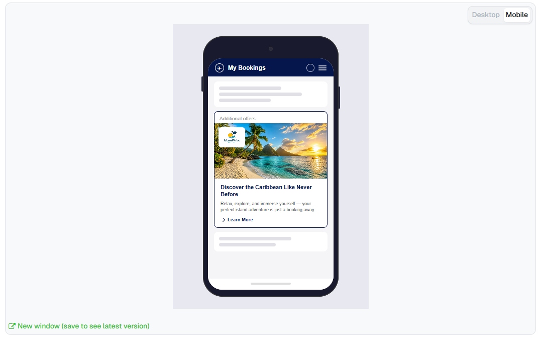 If the preview appears small due to the panel layout, click
Open Preview in New Window or Collapse sidebars at the bottom
of the preview panel to see the full-size render.
The preview reflects the last saved version. Click Save changes
before opening the preview in a new window to see your latest edits.
***
## Saving
Click Save changes in the top right when you're happy with the
creative. The creative is now ready for review before the line item goes live.
Once assets and components are complete, share a preview link with the client
for approval before go-live. See [Sharing preview links](/creatives/preview-links).
If the preview appears small due to the panel layout, click
Open Preview in New Window or Collapse sidebars at the bottom
of the preview panel to see the full-size render.
The preview reflects the last saved version. Click Save changes
before opening the preview in a new window to see your latest edits.
***
## Saving
Click Save changes in the top right when you're happy with the
creative. The creative is now ready for review before the line item goes live.
Once assets and components are complete, share a preview link with the client
for approval before go-live. See [Sharing preview links](/creatives/preview-links).